
Tairāwhiti Covid-19 Epidemiology
Tairāwhiti Covid-19 Epidemiology
1: Overview and ethnicity; lives not lost during pandemic

As Covid notifications remain low (17 this week vs. 26 and 14 for the two previous weeks), I start to review our Covid experience. No new cases in typhoid cluster, and only 3 other notifications this week; all enteric infections: Campylobacter, Shigella and Salmonella. The latter two acquired overseas.
Luck, location, and low population
As WHO declared pandemic end, Bloomberg opinion compared country outcomes. They report that Aotearoa (NZ) “fared the best, teaching us that geographical advantages matter, but so does clear, consistent leadership.” The comparison was based on excess deaths - see below for data and charts.
Like NZ, Tairāwhiti benefitted from its location and low population compared to the rest of NZ. We were the only NZ district to have no local spread of Covid-19 until Omicron arrived in late January 2022. So our Covid epidemiology is that of Omicron, starting from 2022.
With Omicron, there was no Public Health response to cases. We did promote individual protective measures: masks (especially for source control), hygiene, and vaccines (at least 3 doses and recent booster to address waning immunity). As a result our experience of Omicron was similar to the rest of NZ.
Omicron cases by ethnicity
Since January 2022, we have received 25,202 notifications up to 30 September 2023. Covid notifications by quarter, from first quarter (Q1) of 2022 to Q3 of 2023 show a steady decline:
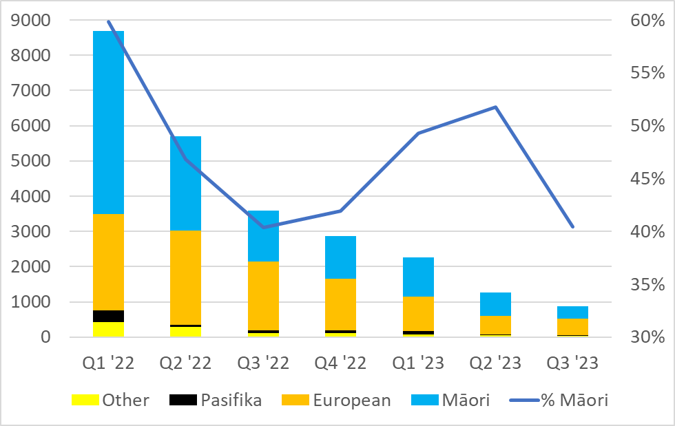
I have included cases of ‘unknown’ (n=212) ethnicity in ‘other’ (n=898) for the chart above. Our Pasifika population is about 3% of total and also of cases (n=682) . But for Māori, after the initial quarter and Q2 of 2022, less than 50% of cases; suggesting greater under-reporting of cases. In general, Māori suffer higher risks of infections from large households and other socioeconomic factors.
Looking at the same data by month from January 2022 to October 2023 highlights the different patterns we see when we change the granularity of the data:
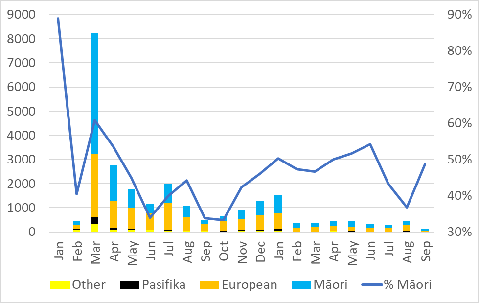
On the monthly chart, the change looks more jagged than the quarterly (increases from October 2022 to January 2023) and a step change in 2023 compared to 2022. The quarterly drop in Q3 vs Q2 of 2023 is largely due to the drop in September. A month that also had the lowest numbers in 2022. But the increase in July 2022 was not seen in July 2023.
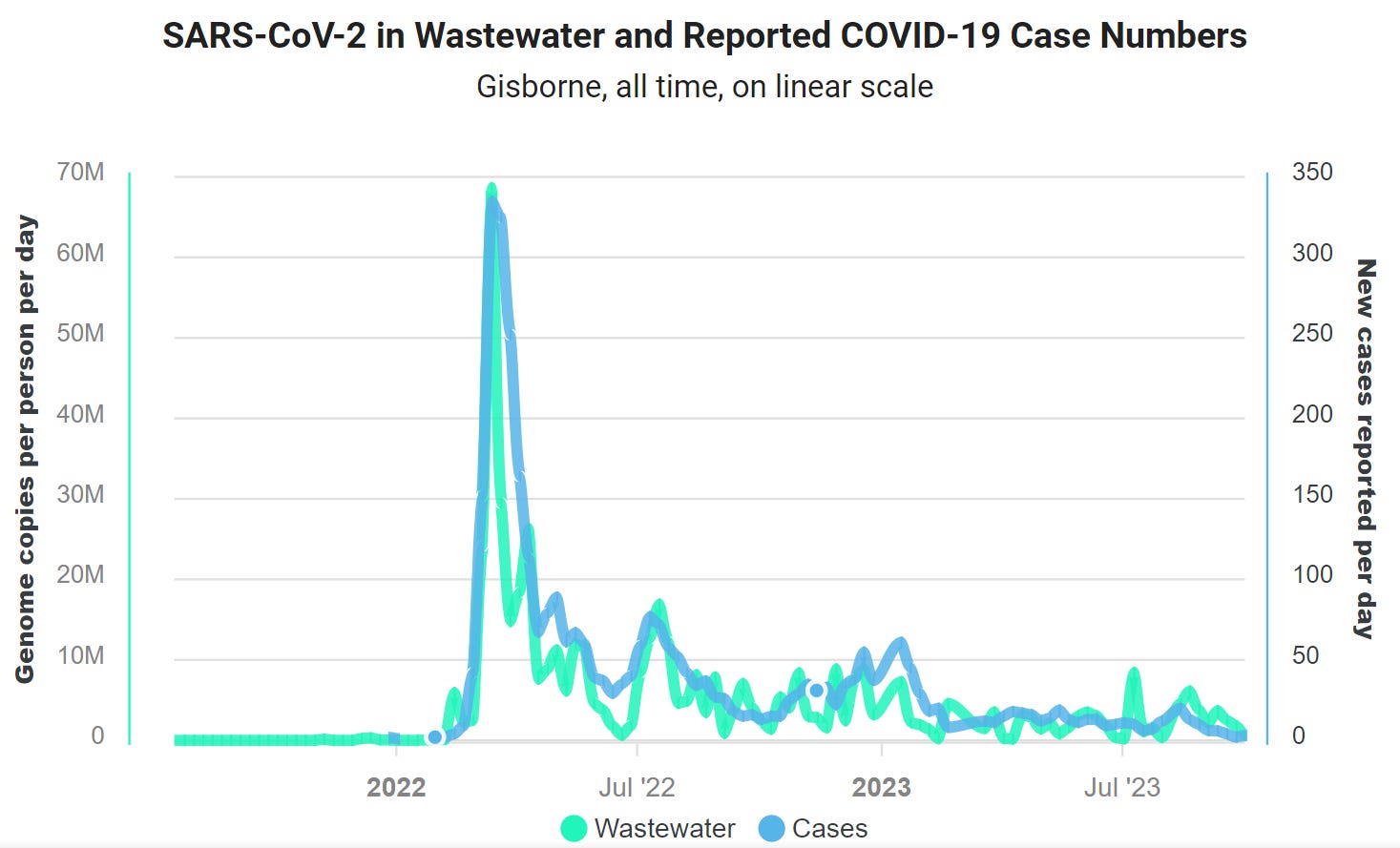
Careful not to over-interpret data, especially as notified cases only represent a proportion of all cases, and I would expect that proportion to drop over time. But, looking at the wastewater data for all time up to week ending 8 October shows the generally good match between the two estimates of viral circulation, and no clear increase in under-reporting:
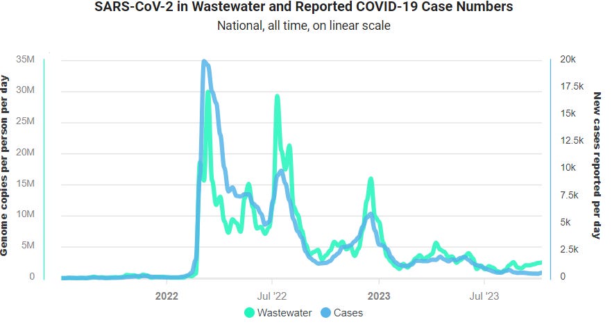
The national data on cases and wastewater show a similar pattern, but suggest more under-reporting recently:
Earlier cases
In Tairāwhiti, our first case was notified on 26 March 2020; the first day of the national lockdown (‘Alert level 4’). The lockdown meant no spread, except to the spouse. We could not confirm another case returned from overseas, but they also infected their spouse whose infection was confirmed leading to 3 confirmed and one probable case by 14 April 2020.
We had no further cases until 24 December 2021, when two linked cases were notified. One more case was notified from this group five days later. Another case of was reported in late January 2022, just before Omicron arrived. These cases were of Delta variant acquired out of the district and with no local spread.
Excess deaths from the pandemic
Bloomberg opinion assessed outcomes based on cumulative excess deaths during the pandemic. NZ was one of the few with negative excess deaths (-57 per million). In other words, 385 people were alive at the end of the pandemic who would not have been alive without our pandemic response – through prevention of other diseases.
The excess deaths metric is a simple measure that was useful to show the level of under-reporting of Covid deaths. The result do depend on the methods used – what is the baseline comparison for the excess deaths.
Ian Powell’s blog used this chart to show how well NZ did in the pandemic, with data up to January 2023:
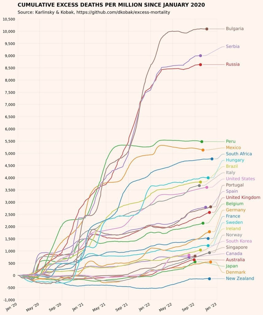
The chart includes 23 countries, with only NZ having negative excess deaths; the next best performers (Denmark, Japan. Australia) had an order of magnitude more excess deaths per million then the ones avoided in NZ.
Our world in data provides the most recent estimate (link has details of different charts and describes the methods). Here I use their chart of cumulative excess mortality per million, with a smaller set of comparison, including Mauritius as another island nation that had good initial impacts from eliminating the virus in 2020, but failed to keep up their good results following Delta spread in 2021.
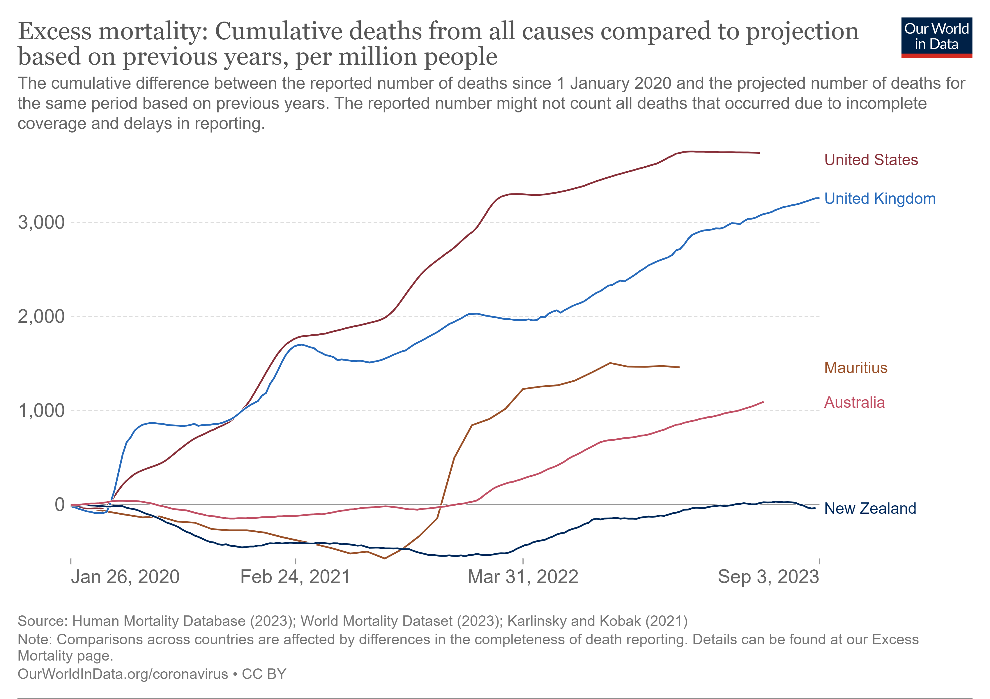
In the above chart, the cumulative excess deaths were briefly positive as a result of winter illnesses before dipping just below. So the overall impact of the pandemic depends on the timeframe of analysis, as well as the baseline used to compare.
Next week
I plan to continue to review our Covid data, with a focus on hospitalizations and data sources. As always, look forward to your feedback and suggestions; and any questions on the data. Thank-you!